
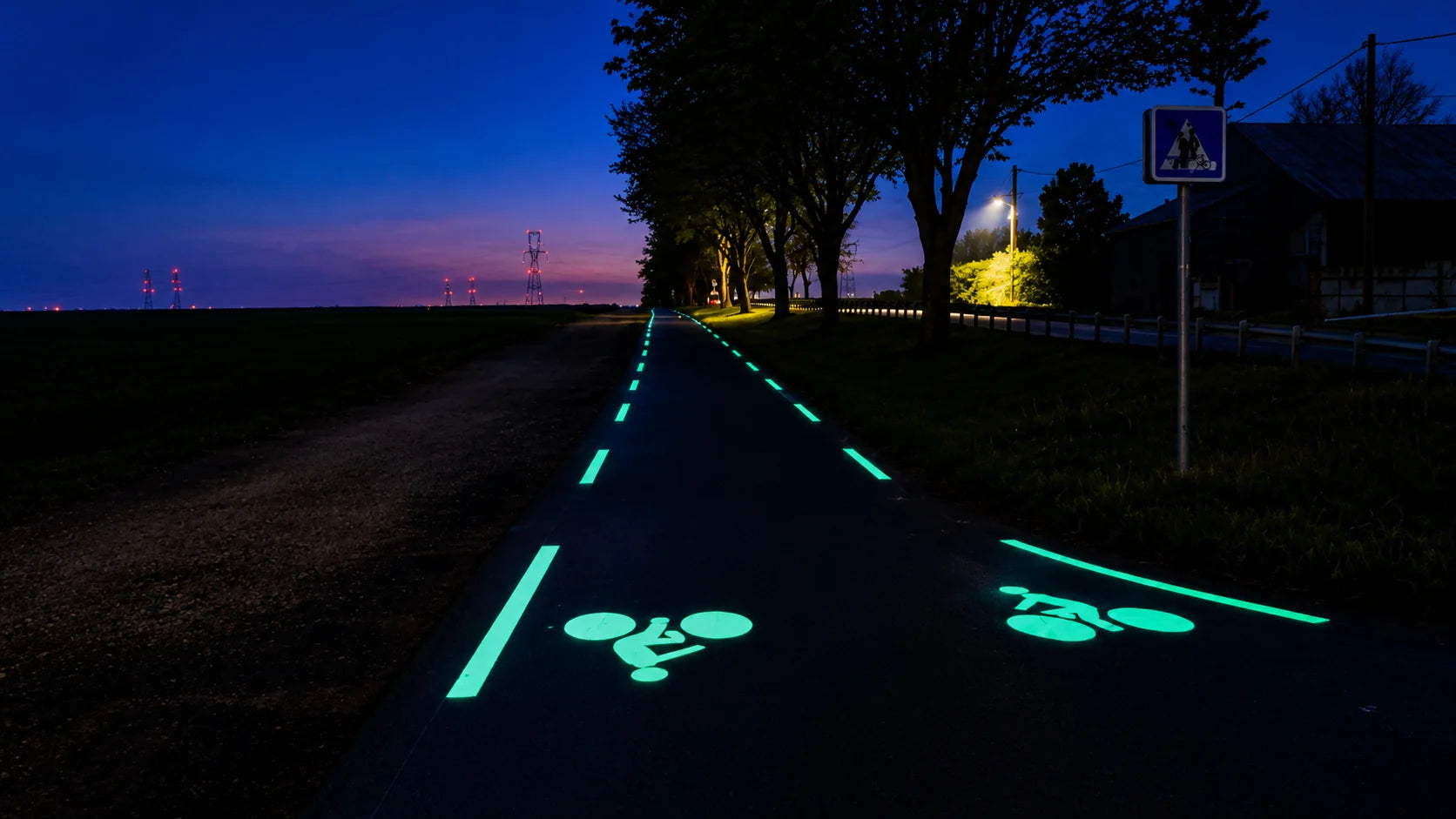
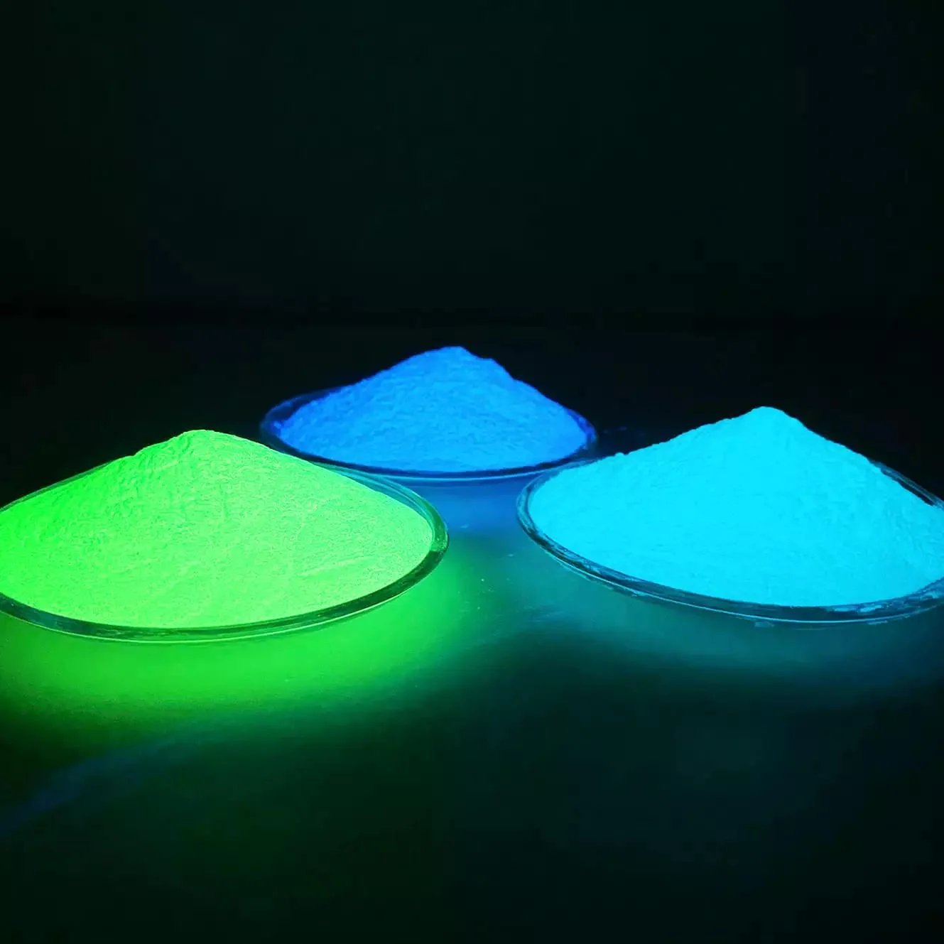
Green photoluminescent pigment is often chosen for stronger perceived brightness and a traditional glow. Blue is often preferred for a cooler, modern appearance, particularly in decorative, poolside, resort, and landscape projects. Neither color is best for every application: the choice depends on glow performance, daytime appearance, background color, binder, lighting conditions, and project design.
Both colors absorb light and release visible afterglow in darkness. They are common choices for luminous coatings, resin products, pavement markings, landscape surfaces, and decorative applications, but color alone does not establish brightness, afterglow duration, or safety suitability.
Green and Blue Pigment: A Quick Comparison
Green photoluminescent pigment
Green is one of the most widely used glow-in-the-dark pigment colors. Depending on the grade, the powder may appear pale yellow-green, off-white, or light green during the day. After sufficient light exposure, it produces a bright green or yellow-green afterglow.
Common applications include luminous road marking, pedestrian walkways, bicycle paths, safety signs, resin products, decorative coatings, landscape pavement, and glow-in-the-dark graphics. The human eye is relatively sensitive to this part of the visible spectrum, which can make green glow particularly noticeable in dark environments.
Blue photoluminescent pigment
Blue photoluminescent pigment produces a blue or blue-green luminous effect after charging. Its daytime appearance may be pale blue, white, or light blue-green, and its glow can create a cooler, more modern effect than traditional green.
Common uses include decorative resin products, poolside applications, resort landscapes, modern pavement designs, interior decorative coatings, custom luminous graphics, and artistic projects.
Brightness and Afterglow: Compare the Products, Not Just the Colors
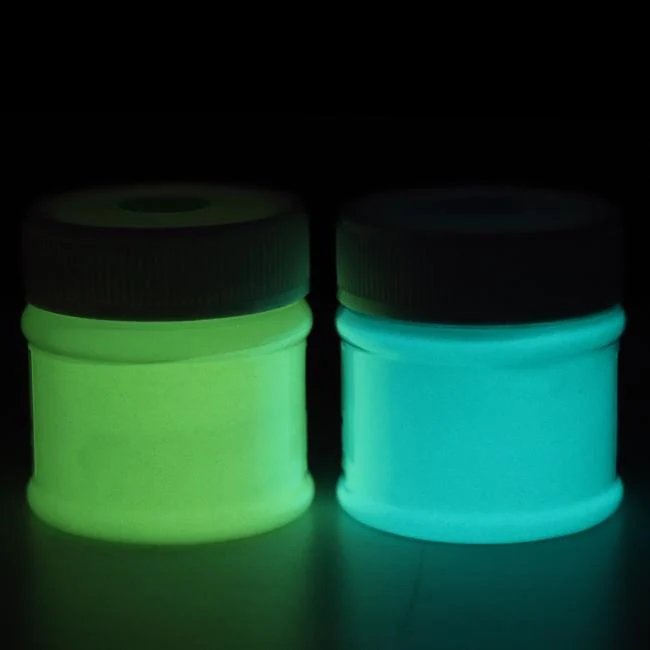
In many applications, green tends to appear brighter to the human eye. This does not mean every green pigment has better technical performance than every blue pigment. Actual brightness depends on:
- Pigment formulation and particle size
- Charging conditions and pigment concentration
- Binder transparency and coating thickness
- Surrounding darkness
Two products with similar daytime appearance can perform very differently after dark. Afterglow duration depends primarily on the quality and chemistry of the photoluminescent material; a high-quality blue pigment may outperform a low-quality green pigment.
Compare initial brightness, brightness after several minutes and after a longer period, charging speed, and color consistency. For commercial projects, evaluate the full afterglow curve rather than only the first few seconds after charging. Sample testing is more reliable than choosing by color alone.
Match the Daytime Appearance to the Design
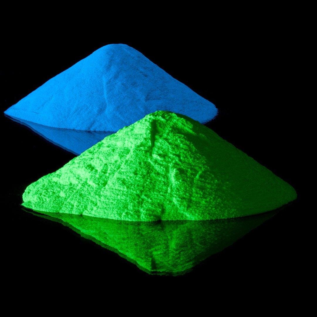
Nighttime glow is only part of the design. The pigment also affects how the finished product looks during the day, so its daytime color should suit the overall project.
- Green: Pale yellow-green or off-white materials can work well with white backgrounds, light concrete, neutral resin, and green landscape environments.
- Blue: A cooler daytime appearance can work well with grey pavement, white resin, blue decorative surfaces, pool environments, and modern architecture.
Choose the Color for the Application
Road markings and safety-oriented uses
Green can create strong visual contrast on dark pavement and is commonly selected for luminous pavement markings. Possible uses include pathway edge lines, bicycle symbols, direction arrows, pedestrian graphics, and decorative road lines. Dark asphalt combined with green luminous marking can create a highly visible nighttime effect, but official traffic markings must still comply with applicable local standards.
For safety-oriented applications, visibility matters more than aesthetics. Green is commonly selected because it often produces strong visual recognition, but actual safety performance depends on material quality, contrast, marking size, charging, location, and relevant standards. Photoluminescent material should not automatically replace required emergency lighting or regulated safety systems.
Bicycle paths
Both colors can work on bicycle paths. Green may provide stronger visual contrast in dark environments; blue can create a more distinctive modern appearance. Consider pavement color, surrounding lighting, route design, local marking requirements, and the desired nighttime atmosphere. For large bicycle path projects, test both colors on the actual pavement.
Pedestrian walkways
For pedestrian paths, the choice is often more aesthetic. Green can create a natural appearance in parks, gardens, greenways, and scenic routes. Blue can work well in resorts, commercial landscapes, waterfront areas, and modern public spaces. Both colors can be used for edge lines, symbols, patterns, and decorative guidance.
Landscapes and pool surroundings
Blue is often selected for decorative landscape pavement around swimming pools, hotels, resorts, waterfront paths, decorative plazas, and modern gardens. Its cooler glow can complement water, stone, glass, and contemporary landscape materials.
Blue and blue-green can visually connect with pool water, blue lighting, and modern resort architecture. Green can also suit pool surroundings, especially where the landscape contains substantial vegetation. Poolside projects should also consider slip resistance, water resistance, cleaning, and UV exposure. The complete coating system must be suitable for wet environments.
Decorative designs and combinations
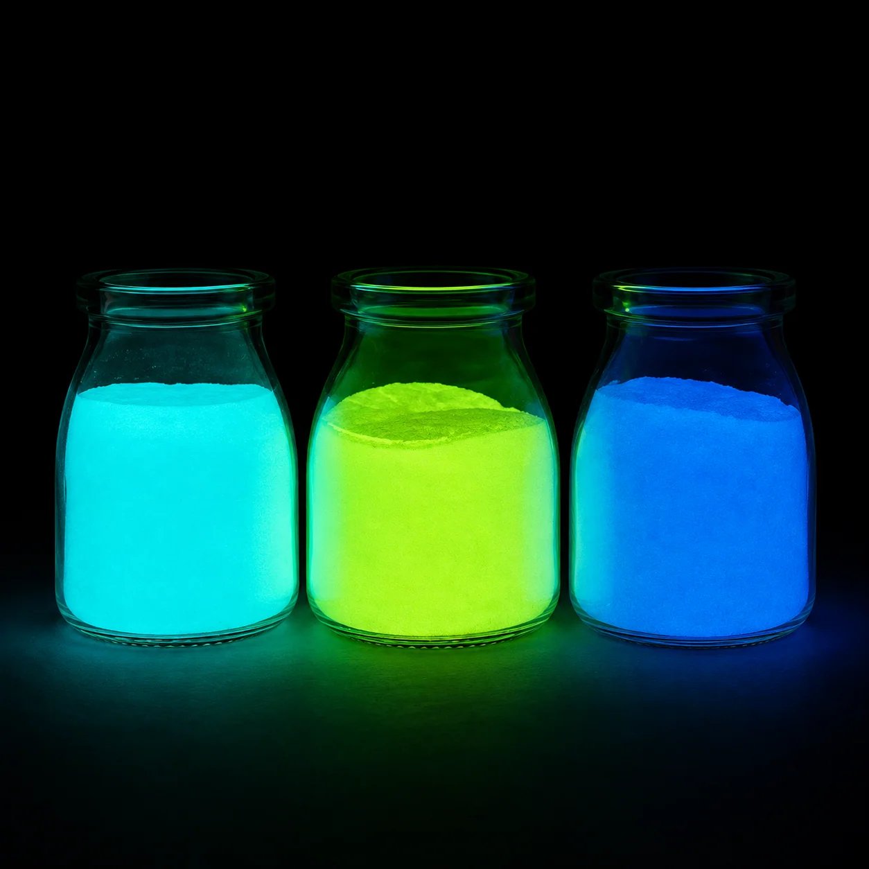
Decorative projects allow more flexibility. Green can provide a strong traditional glow, natural landscape appearance, high visual contrast, and a classic luminous effect. Blue can provide a cooler modern appearance, a pool or waterfront atmosphere, contemporary design, and decorative contrast. Choose the effect that fits the project environment.
Some decorative applications can combine the colors through green edge lines with blue symbols, mixed decorative resin panels, blue and green landscape patterns, or multi-color pavement graphics. Test the pigments together: mixing may change the final glow color, brightness, daytime appearance, and pigment distribution. Always create a sample before large-scale use.
Check the Background, Binder, and Use Conditions
Background color
A white or light background can reflect light and may help a luminous coating appear brighter. A dark surface can create strong nighttime contrast. For road marking, a light base layer beneath the luminous coating may sometimes improve visible brightness. The best arrangement depends on the coating structure and project design.
Binder transparency and pigment concentration
Both colors need sufficient light exposure. A transparent or light-transmitting binder is usually preferred, especially in resin and coating applications. A dark or opaque binder can reduce charging, visible brightness, and afterglow. Always test the pigment with the actual binder before production.
Concentration also affects the result. Too little pigment may create weak coverage, while too much can affect viscosity, flow, surface finish, adhesion, and mechanical performance. Green and blue pigments may behave differently depending on particle size and formulation. Determine the correct concentration through sample testing.
Indoor, outdoor, and surrounding light conditions
Both colors can be used in compatible indoor and outdoor systems. Outdoor applications should account for UV exposure, rain, temperature changes, moisture, and surface wear. The binder and protective layer are just as important as the pigment; outdoor pavement needs a complete system designed for the actual environment.
Both colors can appear strong in very dark conditions. Under streetlights or landscape lighting, however, their perceived color and brightness may change. A completely dark room is not enough for evaluation: check samples under realistic project lighting.
Test Samples Under Real Project Conditions
Before placing a large order, prepare samples using the actual pigment, binder, background color, coating thickness, and surface material. Charge them under normal project conditions, then compare:
- Immediately after dark
- After several minutes
- Later in the evening
- Under the surrounding lighting
This is a more realistic comparison than viewing loose pigment alone. For large-scale applications, testing both colors in the intended system and environment is the most reliable way to decide.
Questions to Resolve Before Choosing
- Is the application decorative or functional?
- Is the project indoor or outdoor?
- What color is the pavement or resin?
- How much daylight will the area receive?
- Is the surrounding environment dark or brightly lit?
- Is stronger visual contrast important?
- Does the design call for a modern or natural appearance?
- What binder will be used?
Green and blue can both create effective glow-in-the-dark surfaces. Use the answers and sample results to balance glow performance with daytime appearance and the requirements of the complete project.
FUXIN supplies Green, Blue-Green, and other Photoluminescent Pigments for luminous pavement, road marking, resin products, coatings, and landscape applications. Product information, samples, quotations, and material recommendations are available for different projects.
Contact us to choose the right photoluminescent pigment for your application.